Brand guidelines
The next2u brand, in one place
Built in Luxembourg, for the people right next to you. The marks, the colours, the type, and the principles behind them.
Logo
The logomark.
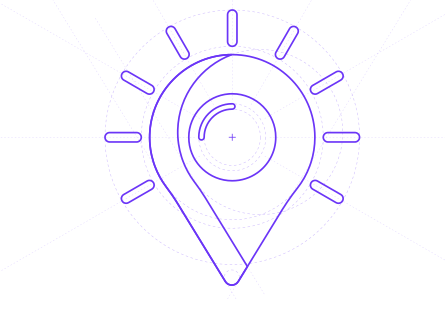
A radiating sun whose rays enclose a teardrop, a pin dropped right where you are. It stands for locality, warmth, and the simple act of finding something close. It may appear on its own, in its native gradient wherever the surface allows colour.
Construction
Geometric anatomy.
Every element of the mark relates to a single base unit, the diameter of the pin. Nine rays radiate at 30 degree intervals; the eye is one third of the pin, the inner highlight one fifth of the eye. These proportions are fixed.
- |9 rays · 30°
- |ray ≈ 1/6 × pin
- |eye ≈ 1/3 × pin
- |highlight ≈ 1/5 × eye
Safe zone
Room to breathe.
The logomark is always surrounded by empty space. Define x as one sixth of the mark's width; the safe zone is the one cell ring around it. Nothing else enters that space.
Wordmark
The wordmark.
Our name in a custom geometric sans, set all lowercase to feel approachable rather than corporate. Used on its own when the logomark would be too small, or in horizontal contexts like footers and document headers.
Lockup
Combining the marks.
Two valid forms. The signature lockup pairs the icon and wordmark with the skewed rule between them, our distinguishing separator. The horizontal lockup sets them side by side, no rule, for compact surfaces.
Variants
Three approved variants.
Chosen for the surface and the production constraints. Gradient is the default; fall back only when colour fidelity is impossible.
Gradient
Full colour mark. Dark surfaces, screen-first contexts, marketing and product UI.
Mono white
Single ink pin for dark or photographic surfaces without colour fidelity.
Mono black
Single ink pin on white. Invoices, correspondence and mono print.
Misuse
Do's and don'ts.
Do not alter the mark. The gradient and the geometry are the brand; recolouring, stretching or layering effects erodes recognition.
StretchRotateRecolourOff-palette groundBusy groundCorrectColour
Brand colours.
Anchors
Two structural colours that carry every surface. Navy for documents and trust, Night for product canvases and presentations.
Accents, sampled from the logo
Four colours pulled from the gradient stops of the logomark. Use them sparingly: data viz, hover states, callouts. Never as a flat background.
Navy
Night
Azure
Teal
Sun
Coral
Copy · hex · pantone
Typography
Type system.
Gabriela is the editorial display serif — headlines only, covering Latin and Cyrillic. Geist carries the interface, body and numbers. Geist Mono is reserved for identifiers, code and metadata.
Co-branding
Co-branding with partners.
When next2u appears with a partner, the lockup pairs with the partner mark using the multiplication sign as the separator. Navy on light surfaces, white on dark.
Downloads
Brand assets.
Everything you need to use the next2u brand: the logomark, the wordmark, every variant, and this book.